
Taking inspiration for my layout
Creating my layout for my report -
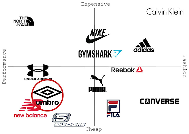
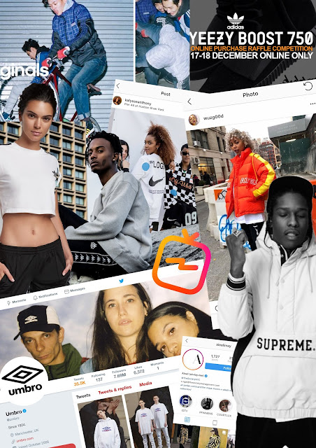
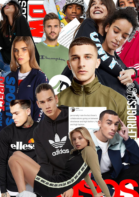
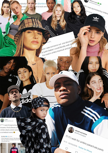
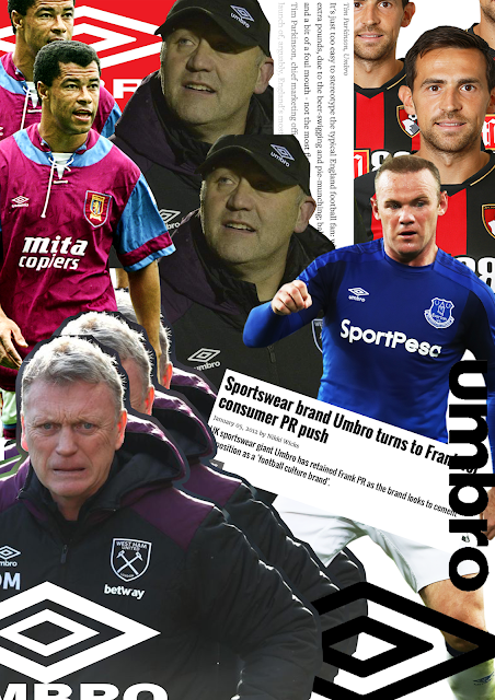
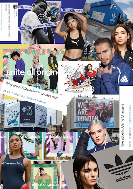
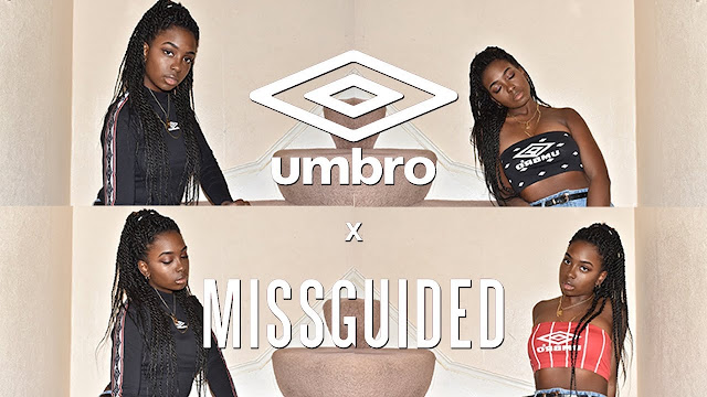
I first went onto Pinterest and had a look at some brand report layouts to get inspiration for my own, I also looked on the website https://issuu.com which showed me some pre-exisitng brand reports so I could have a look through some to see how they have been laid out. The ones I had a look at were Umbro's competitors which included looking at Nike and Adidas and some of the Adidas ones tend to keep there's quite simple with having a monochrome colour scheme which is their logos colours which I think represent the company quite well. This might be something that could be something that I could take inspiration from and could be a success for myself as this is also Umbro's logo's colours so representing this in my layout might work for me. Also I've been looking at ways to set out my pages and how using photos will work for me, having a look at this other brand report shows that using full page photos and text on the opposite side works very well and looks professional as well as being clear to understand and easy to read. This is something I would like to do within my own because there are a few images I think represent my ideas for the brand and I would like to showcase these on a bigger scale.
 |
| https://issuu.com/emilysummerscales/docs/ didas_brand_report_finshed_no_blee |
 |
| https://issuu.com/clemmiehyde/docs/ vetements_copy |

Comments
Post a Comment